Case Studies - South Indian Online News Portal
Project Overview
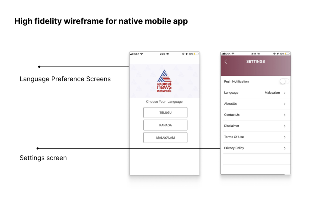
sianetnews.com is a South Indian online news portal with the tagline “Straight, bold, relentless” This news site provides a variety of news (local, national and international) in real-time and in multilingual format (Malayalam, English, Kannada, Telugu, Tamil).
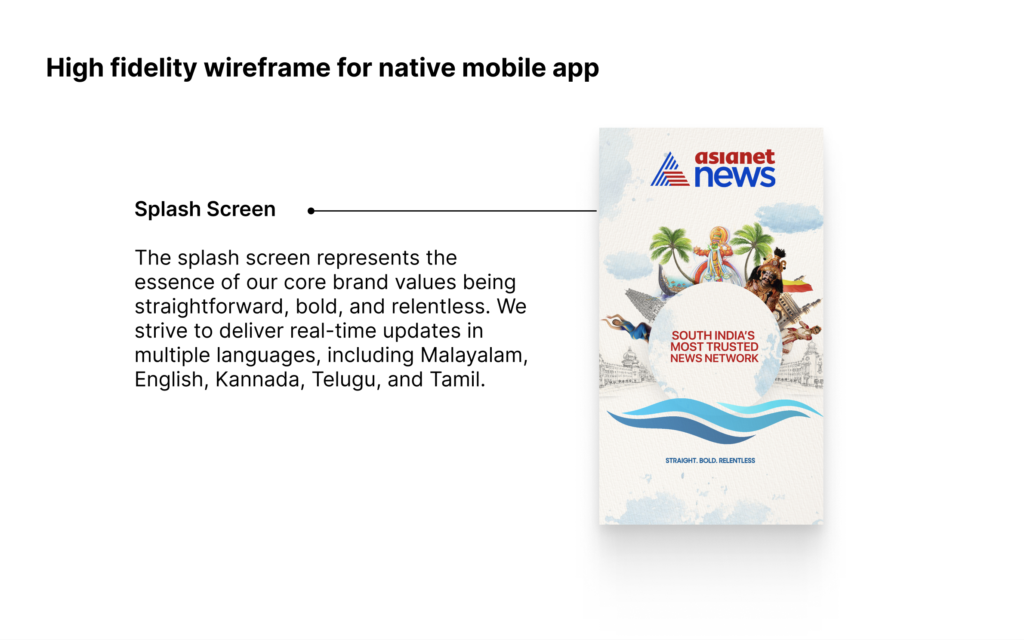
Keeping up with the changing facet of information, Asianet News also has a mobile app, which makes it easier for readers to get news on the go.

Design Challenge:
Gain popularity amongst young users without losing its already existing clientele.
My Role:
UX/UI Designer
Responsibility:
- Current app analysis
- Competitive analysis
- User interviews
- Personas
- User flows
- Information Architecture
- Wireframes
- UI and Visual design
Tool Use:
Adobe XD, Illustrator, Photoshop, Mural
Project Duration:
3 months after product launch continuing to improve the product. (Feb 2018 to Jan 2019)
Stakeholder Mapping
I start with Stakeholder mapping, which is a valuable tool for me as a UX designer, and it helps me to navigate the complexities of project environments, prioritize user needs, and collaborate with various teams and individuals effectively. Understanding and involving stakeholders throughout the design process is crucial for delivering user experiences that meet user and business objectives.

Design Process
My design strategy adapted the well-known “Dubbel Diamond Design Process”, which I have customized to suit different needs and objectives. This approach has proven highly effective in achieving desired outcomes and delivering optimal results.

Company Goals:
- Increase Traffic to 1 million per month
- Increase revenue through Ads.
- Well-organized content within a user-friendly App
User Goals:
1. The user expects the home screen to have clear and easy-to-use navigation and interaction options.
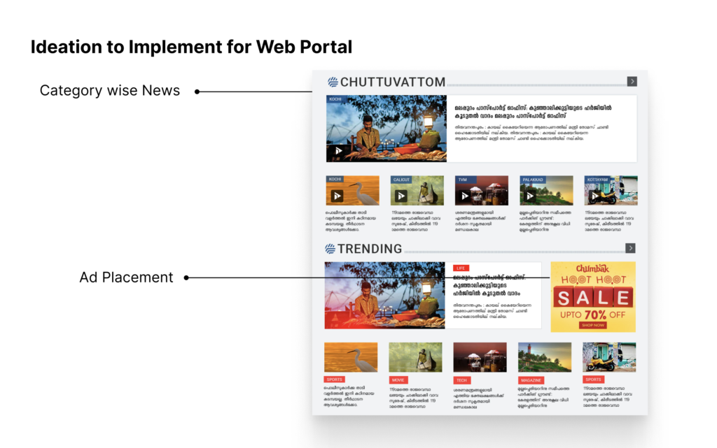
2. The user needs news listings organized by categories such as “Politics”, “Latest”, “Sports”, etc.
2. Desires to access a live news TV channel through a website or app.
3. Easily find bookmarks and read detailed news without interruption from ads.
4. Find the news category through search or Navigation.
Secondary Research:
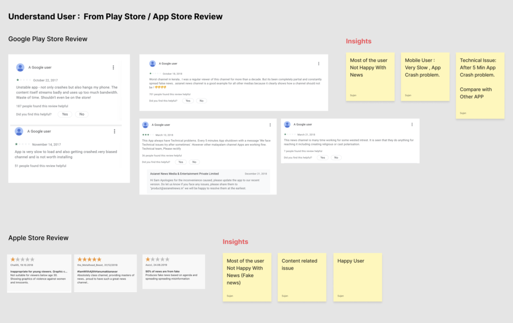
External : Play Store / App Store Review: In addition, I also spent a considerable amount of time going through the reviews posted in Playstore and App Store.
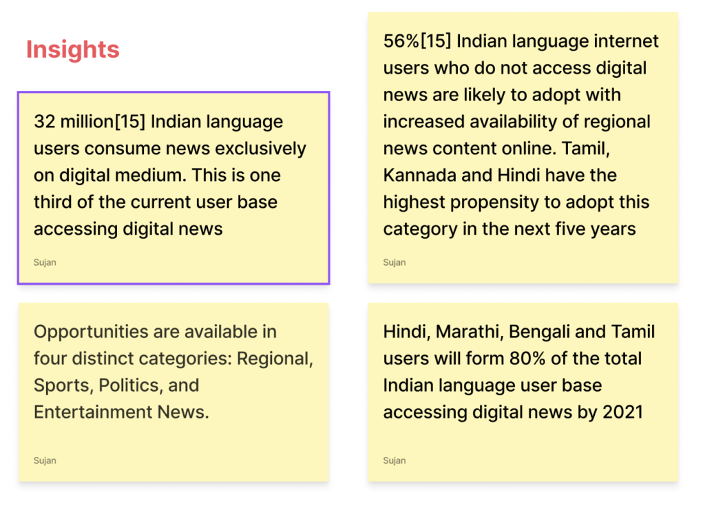
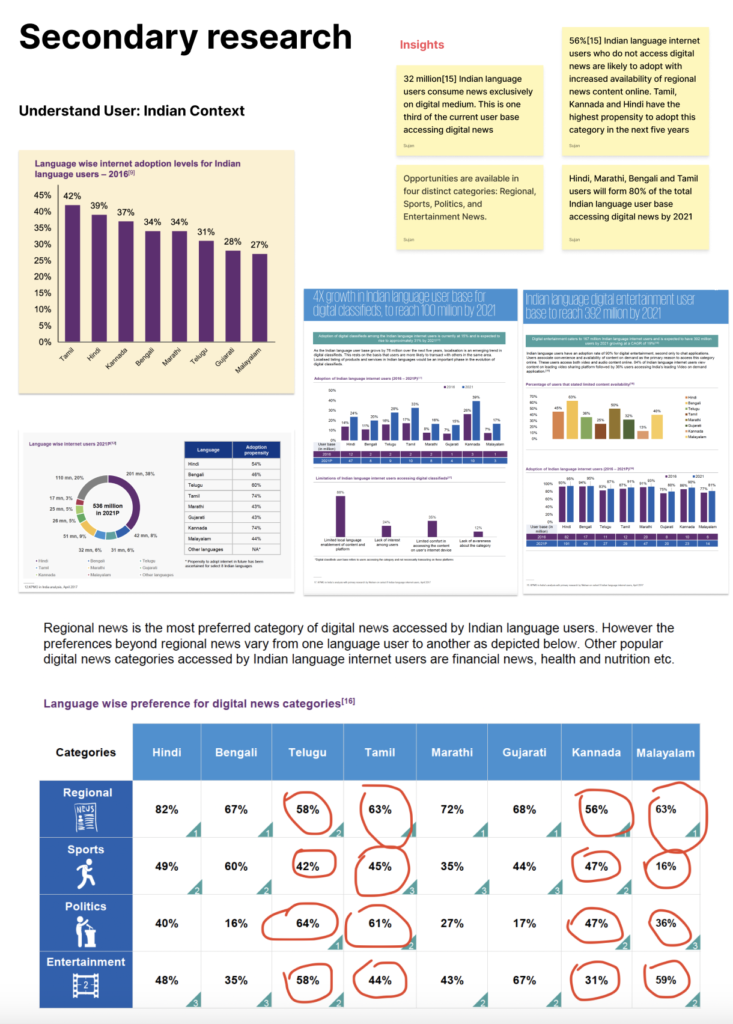
Additionally, I conducted online research, which helped me discover valuable insights that proved helpful in creating a solid information architecture. This architecture includes well-defined categories and well-organized sub-categories that help users easily navigate the website.
Primary Research: & Journey Map:
Persona Interview: I created a persona and journey map based on the users, I spoke to during user interviews. Also, I define a typical user’s personas based on their demographics, needs, and frustration.
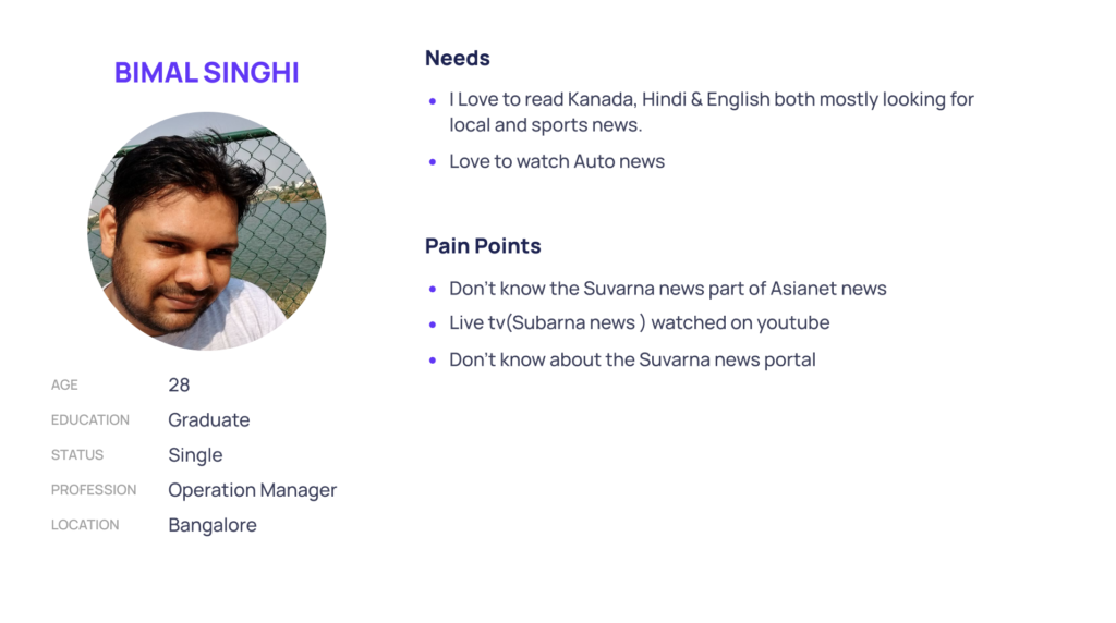

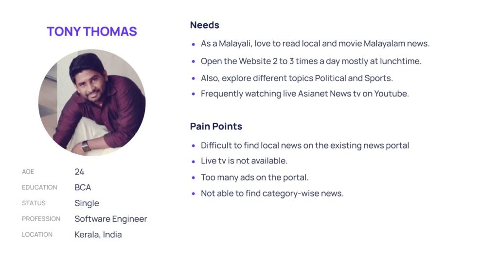
Also, we created a User Journey Map with their thoughts, feelings, pain points, and various touchpoints. It helped me see their end-to-end experience from a bird’s eye view.

Information Architecture:
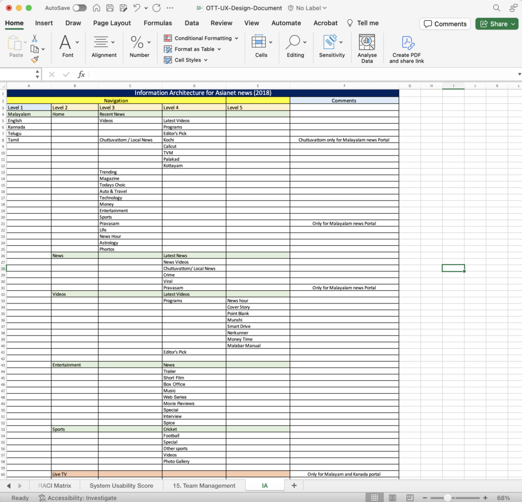
Our team is implementing a close card sorting technique to establish the website’s Information Architecture. This method involves inviting users to organize the content into categories, which enhances the website’s overall usability and navigation.
We invited six editors and eight journalists to participate in this activity. Following the sorting technique, we documented the results in an Excel file and shared it on SharePoint for easy access by all stakeholders.
Key Findings:
News Reading Time — Most of the participants didn’t have enough time to read stories, they only had about 10–20 minutes as they usually read the news on the go.
Need Trigger — Most of the participants need triggers that motivate them to read the news, for example, triggering trending news.
Reaching out Search Function — Most of the participants’ difficulty reaching features in the top bar, ex: search, bookmark, profile
Pain Points:
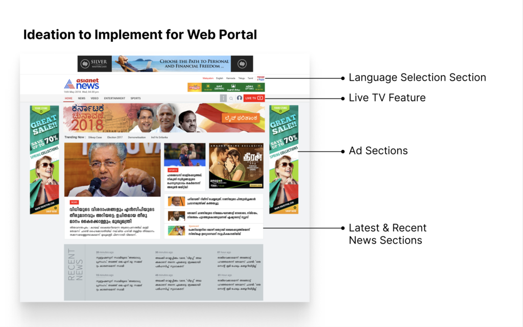
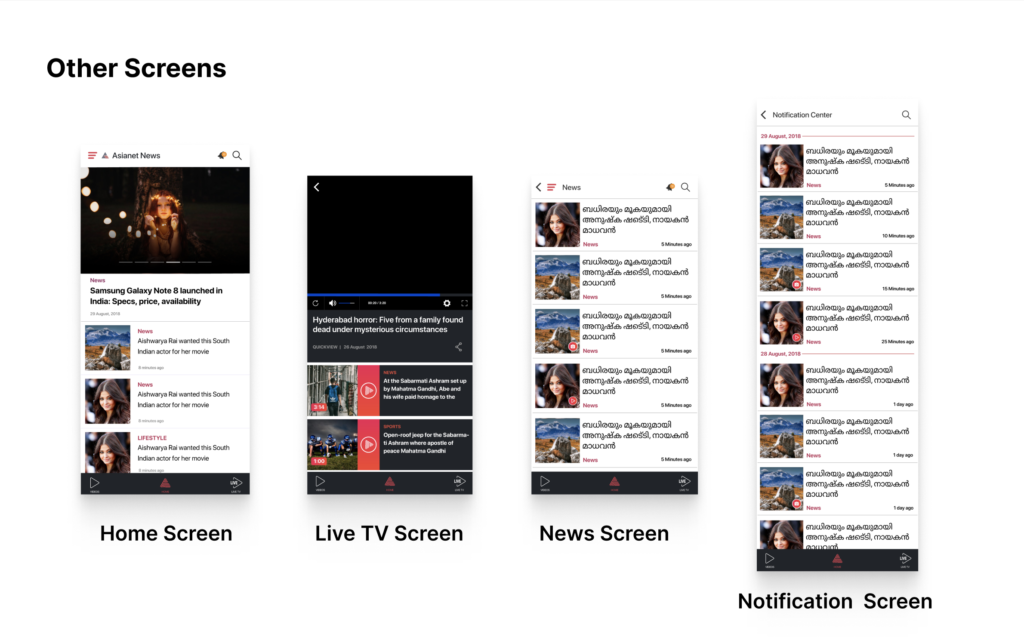
- Navigation and Interaction in the home screen the list news is confusing. The news wasn’t grouped such as “Latest”, “Sports” etc. which makes it useful to screen through.
Users were not able to find the Live News TV channel.
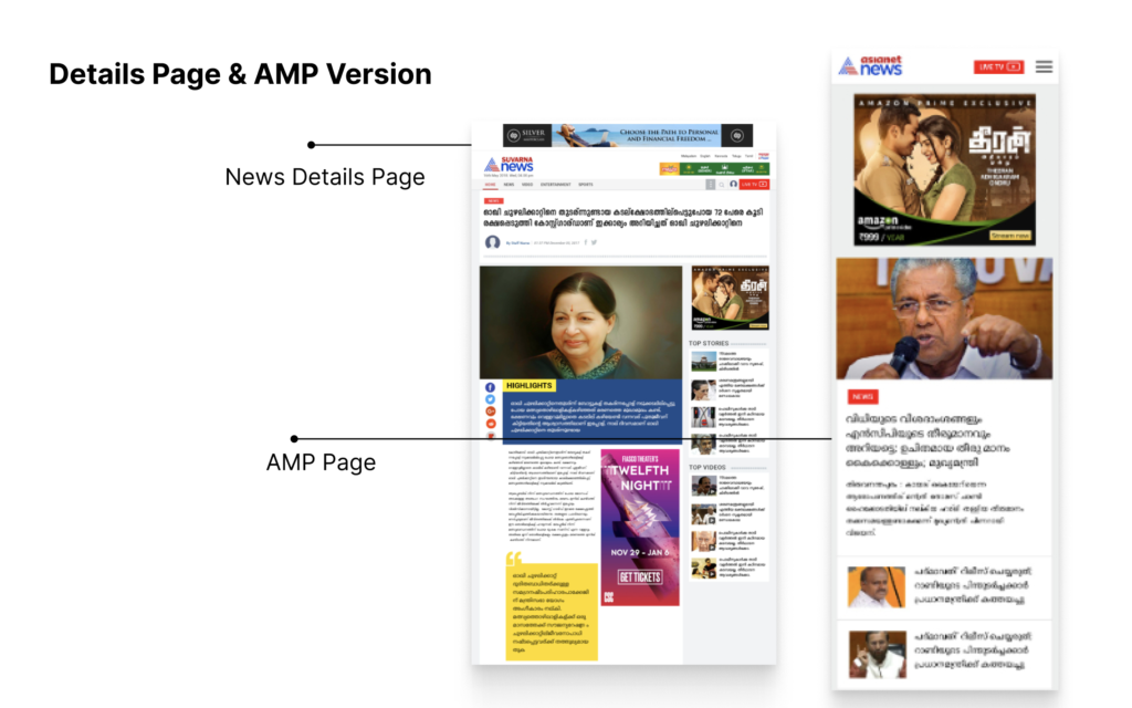
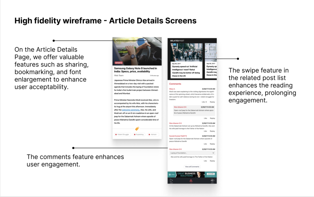
When one read the detailed news, finding the bookmark was a pain, not to mention the constant ads that disturbed the readers greatly.
Users were not able to find the news category through search or Navigation.
Ideation to Implement Process
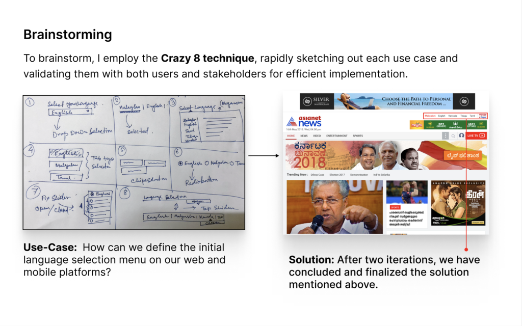
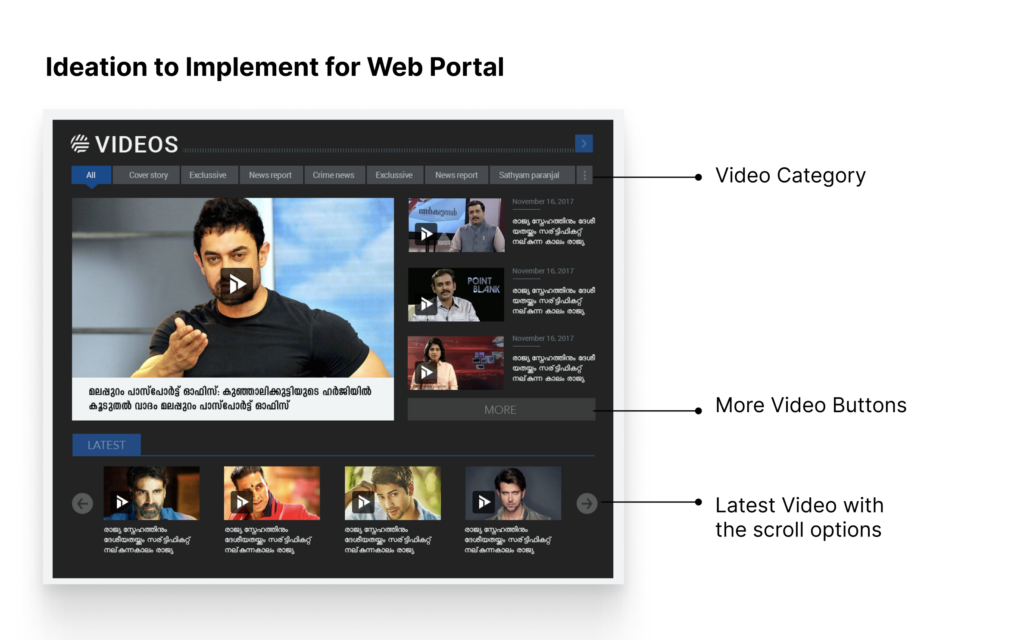
As a UX designer, I collaborate with the Dev, Product, and Marketing teams to plan each 2-week sprint. We prioritize 5-7 tasks and 3-5 change requests during this process. Following this, we followed the below method to ensure that our work is organized and efficient.
Start with the Paper Sketch I started sketching out solutions on paper to give freedom to my flow of thought and not be constrained by details.

Testing and Validation:
After creating the prototype, I tested my solutions using the same usability test task/questions from my initial tests. To measure success during validation is to see how the user can perform a given task without significant difficulty. To compare usability and to prove with new design increase reading interest.

Feedback from Participant:
- High satisfaction rate observed with the new design amongst the test samples.
- Received positive feedback about the inclusion of the top bar which helps to search .
- The new design was accepted as more organized and provide more information.
- Also they are happy when they found online news channel in the app.
Achievement:
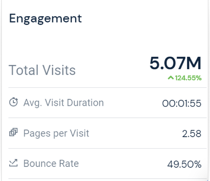
Asianet news App grew to
30k+ visits per day.- Asianet news Website grew to
500k+ visits per day.
Conclusion:
From the results of the validation, it can be concluded the design that I proposed can further enhance user experience in using Asianet News, but it still needs to be iterated for several points.
Visit the final product:
Download the App from Google Play Store:
https://play.google.com/store/apps/details?id=com.vserv.asianet&hl=en_IN&gl=US
Download App from Apple Store:
https://apps.apple.com/in/app/asianet-news-official/id1093450032
Other Case Studies
Some case studies in this portfolio are under non-disclosure agreements (NDAs). As such, I have masked some information to protect the confidentiality of the projects.

A novel application called Intelligent Segmentation App app can help businesses get comprehensive segmentation outcomes based on their existing data and business requirements.

A Work Management System is an integral part of a safe system of work. Work management system (WMS) is a fundamental requirement for workers in the oil and gas industry.